By Dimitra Gatzelaki,
In late February of 2024, one of the most anticipated film releases of the year came out; Dune: Part Two. The sequel to Denis Villeneuve’s Oscar-nominated film Dune (2021) pulled film-goers back into its futuristic, interstellar and expansive world. But of course, like most fiction in this day and age, Dune is an adaptation of Frank Herbert’s sci-fi novel series of the homonymous title, first published in 1965. And it’s not the first time it’s been transferred to the big screen, either; its first film adaptation was in 1984, directed by David Lynch. Yet many would argue that the 21st century adaptations far exceed the previous one, at least where the film’s cinematography is concerned, orchestrated by Greig Fraser. In this article, we will take a look at the most dominant colors used in Dune: Part Two, and what they might signify for the film’s essential meanings.
To begin with, it’s important to mention that color is a vital element in film, especially in cinematography. Not only does it set the mood and the distinctive, overarching character of the narrative, but it also provokes a psychological reaction in the audience (since colors are known to trigger emotional response). In Dune, and Dune: Part Two in particular, cinematographer Greig Fraser dexterously plays with color and hue to signify the contrast between the narrative’s worlds, as well as what color might signify for the worlds themselves and the people in them.

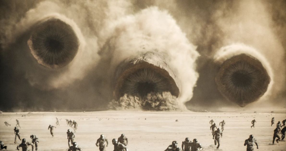
In Dune: Part Two, the vast majority of the scenes, and particularly the most iconic ones, take place in the desert planet Arrakis, which is valuable for its spice and deadly due to its sandworms. In contrast to the heavy brightness and glow one would expect in a desert environment, the colors in Arrakis don’t radiate the sun’s scorching heat, but are set in cooler tones. In using a palette of chilled, frigid beige shades, Greig Fraser actually amplifies the sense that what we’re watching isn’t unfolding on Earth, but somewhere otherworldly; a deserted place with its own rules. This choice in color was made in collaboration with Villeneuve. The film’s director needed the world of Dune “to feel completely different from what we know”, explaining that “Arrakis is harsh, but not classical desert-harsh with blue skies and yellow sand”. Color, then, serves to enhance the alien character of Arrakis in the eyes of the viewer.
Still, the true beauty of how color is used in the film lies in its striking contrasts. Returning to my earlier point about color being used to convey the contrast between worlds, let’s consider another significant setting in Dune: Part Two; the planet of the Harkonnens, Giedi Prime. As a general rule, scenes filmed in the interiors of Giedi Prime have dark, muted, strangely cold colors. Hues of black and blue abound, sharply juxtaposing the subdued browns, oranges and whites of the Arrakis landscape. In essence, what Villeneuve and Fraser aimed at with this contrast in color was for “the aesthetic of the evil Harkonnen to signify the polar opposite of the sunlit faith of the desert dwelling Fremen.” Taking this one step further, one can argue that this contrast “visually emphasizes the film’s thematic exploration of political and cultural differences between the various factions”, effectively using aesthetics to signify deeper meaning.

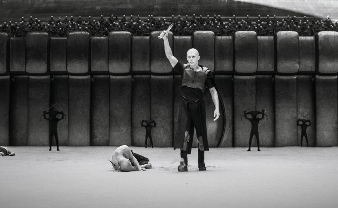
In a particular scene set in the exterior of Giedi Prime, Fraser’s artistic touch shines through, almost making a statement; the arena fight featuring the young heir of Baron Harkonnen, Feyd-Rautha. From a visual standpoint, it is perhaps the most captivating scene in the film, as it is portrayed entirely in black and white. This deliberate color choice, coupled with the unsettling look of the Harkonnen, infuses the scene with an eerie, otherworldly atmosphere that is (again) a polar opposite to Arrakis. In an interview for Inverse, Villeneuve offered insight into why the outside world of Giedi Prime lacks color, which again ties back to the nature of the Harkonnen themselves: “the idea that the sunlight, instead of revealing colors, will kill colors; that their own world will be seen in a daylight as a bleak black-and-white world, will tell us a lot about their psychology.” Just as color signifies things in the narrative, so does its absence.
Greig Fraser added yet another twist by opting to shoot in infrared. “It just has such a weird look to it that’s unusual,” he explained. “It doesn’t look like true black and white. It looks like an anti-sun … but the idea was that maybe what the sun does is it sucks out color.” And while the artistic choice of shooting in infrared is intriguing, it wasn’t random— rather, it was intended to reflect extra non-verbal meaning about the Harkonnen, adding another layer to Dune’s narrative. As Pennington highlights in his article, it felt “like a suitable creative solution to depicting the life-sucking environment destroying Harkonnen.”
Color in Dune: Part Two, then, is used for more than just aesthetics. In the hands of Fraser and Villeneuve, it becomes a powerful narrative tool reflecting thematic depth and visual storytelling where words fall short.
References
- ‘Dune’ cinematographer Greig Fraser sheds light on his craft. Kpbs. Available here
- How Sun Serves as the Color-Killer in “Dune: Part Two”. NABAmplify. Available here
- A Deep Dive into the Cinematography and Color Palette of Dune Part 2, Postpace. Available here


